ARCH
ARCH is a life coaching business, based on Chris Duncan’s Magnetic Mind. ARCH stands for Aligned, Radiant, Conscious, Holistic and the client wanted a logo that represented those principles. The design process can often take us to unexpected places, as we can see here.
The Beginning
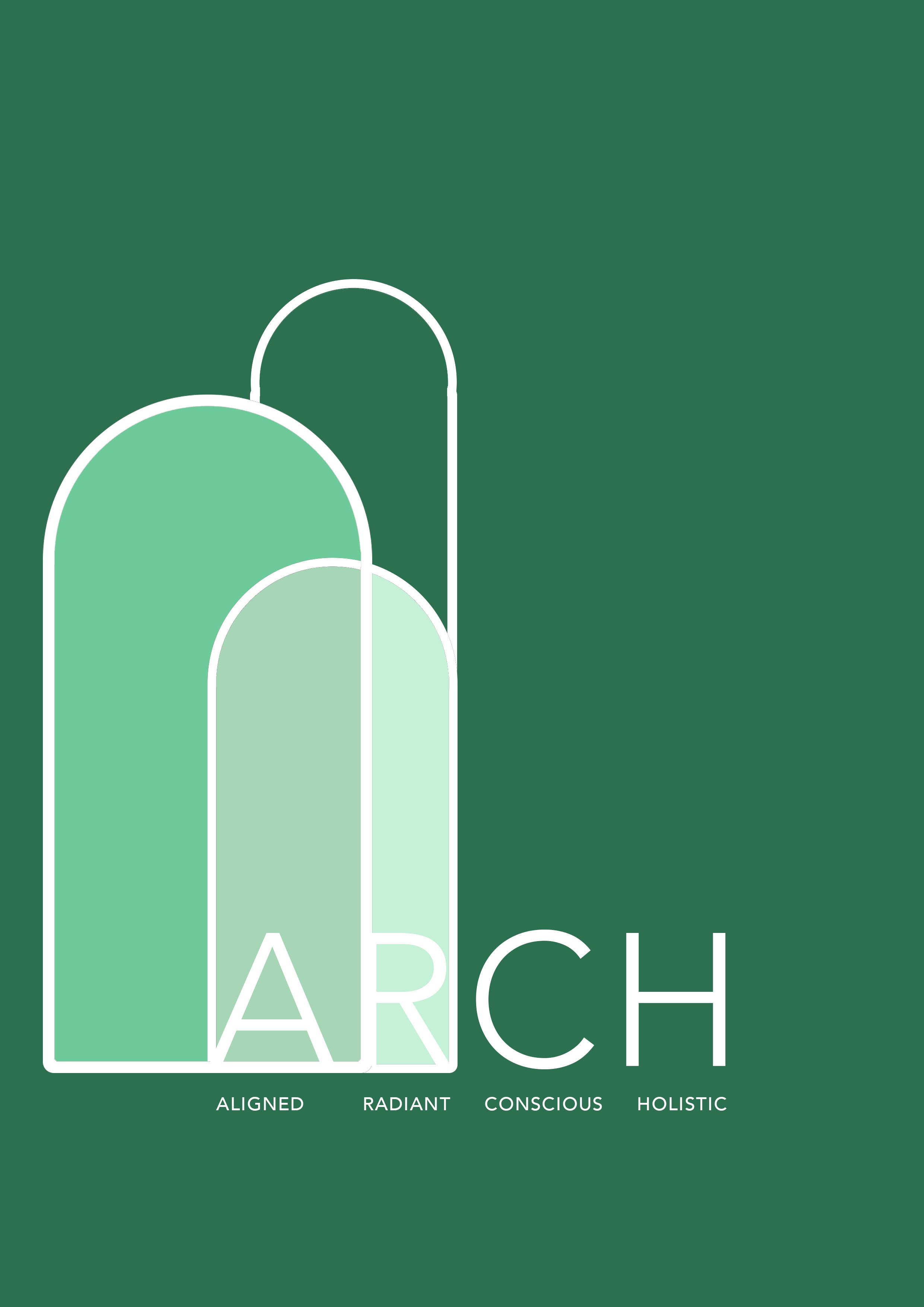
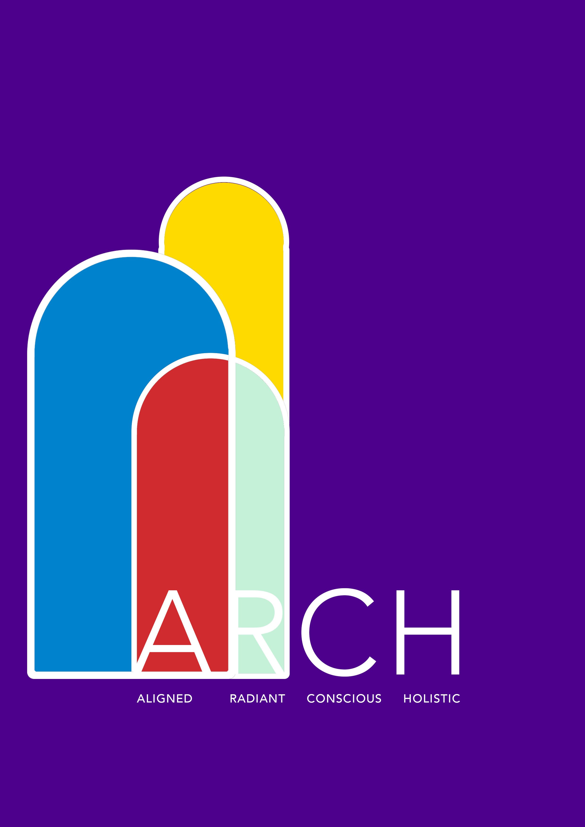
This is the first prototype that I created. The client and I were interested in using an archway to create a visual representation of what happens during life coaching. We also wanted to incorporate the type into the design.


Some more examples of the design process, still utilizing the archway but in different ways and through different treatments. The first two are using a simple archway design, in the different shades of green because green represents growth and change. The client wanted to see the design in primary colours, so I sent through the third image. The fourth image is the most complicated, as it takes the initial design, strips it back tonally and then adds a more visually dynamic elements like perspective. There was also a conscious choice to use more grounded and earthy tones in this design. The client felt that the image had a religious connotation of stained glass windows, so we decided to approach the brief from a different angle.
I have always been interested in typography and creating my own fonts, so I decided to experiment. I was inspired by the Rorschach Inkblot tests and I wanted to see I could translate that same feeling into text. In order to create this, I layered fonts on top of fonts and played around with colours and opacity. While the client liked this approach, they felt that it was too experimental for their brand.
In another discussion with the client, they stated that they wanted to incorporate the light energy atom into the design. Firstly I researched light energy, and saved many images; from there I decided to simplify the atom. I then used a keyhole as a representation of a client unlocking their potential. I also used a san serif font, as a way to juxtapose roundness and angles.
Here is the final design. The client wanted the keyhole to not be so prominent so I reduced it. I decided to add a grid into the background to tie the font together more cohesively. Overall this was a collaborative experience, and with constant contact with the client I was able to fulfill their needs. The relationship between designer and client is a special one, and when both parties come for a place of trust and appreciation, wonderful things can happen.


